Case Study
EveryAction & NGP VAN Conference Booth
I had the opportunity to create a conference booth that was eye-catching, lead converting, and the living, breathing version of our brand. Here's a look at my process of designing a kick-ass booth.
At EveryAction and NGP VAN, we (the marketing team) are true followers, and perhaps even disciples of Inbound Marketing. We attended the official Inbound conference in Boston, and wholeheartedly believe that creating strong content will build a community of do-gooders that will eventually create strong leads for our sales team. We're groupies in the nerdiest way, and we enjoy spreading the good word of Inbound marketing strategy.
Last year I redesigned the EveryAction & NGP VAN booth. We attended and had a booth at the two largest nonprofit/political organizing conferences in the United States. Designing a booth is similar to writing an incredible white paper. In fact, the process is nearly identical. I researched and planned meticulously, I launched it on very little sleep, we threw a party to celebrate the launch, sat back and watched the community interact with it, made some edits, and then relaunched it.
Goal
Our goal was to move away from the traditional, cookie-cutter conference booth. You've definitely seen them before. The formula for a traditional booth is a prefabricated banner and a table covered in a polyester tablecloth with a few pens, white papers, and Hershey Kisses on top. They're every designer's worst nightmare.
Research
Every great project begins with a ton of research and a beautiful mood board. I spent a lot of time thinking through several questions.
What would draw visitors into our booth?
What would keep visitors in our booth?
What kind of interaction do I want our visitors to have with our knowledgeable sales team?
What's the sales team's high-level goal for the conference? Are they trying to build community or have potential clients buy the product on the spot?
Here's a look a the moodboard I created that investigated the first two questions.


After building the moodboard, I thought through the last two questions: What kind of interaction do I want the visitors to have with our sales team? And what is the sales team's high-level goal for the conference?
Visitor-Sales Interaction
Traditional booths usually include a table and chairs, which creates two issues:
The table is a barrier between the visitor and the host of the booth. It immediately establishes a hierarchical relationship instead of a peer-to-peer relationship.
If there are chairs, stools or couches in a booth the hosts become sedentary, and often revert to looking at their laptops or phones when they have pause in booth traffic. However, once their heads are down, they often miss out on conversation with a potential customer or client who's too timid to start a conversation.
I wanted to turn the traditional booth on its head. I was important to me that our sales team to felt approachable from the visitor's point of view, and that they felt comfortable in the space.
Sales Team's Conference Goal
Our company is relatively new to the nonprofit CRM market, and we want to establish our presence by continuing to build relationships with potential nonprofit clients. Their ideal situation was to have a conversation with a booth visitor, gauge their interest and need for a new CRM, and maybe move onto demoing our digital tools. This meant that we needed space for people to mingle and a way to demo our CRM.
The booth: Process
I was given a budget of a few thousand dollars to build a 20 x 20 foot booth. While it's a small percentage of what companies like Google and Facebook would spend on a booth, it was just enough to cover the costs of the project while also forcing me to think critically about the materials I needed to purchase.
We were presenting at two conferences—one in the spring and one in the summer, and I needed to think about how I was going to reuse the materials. I did a lot of list making, sketching of the booth layout and research runs to Home Depot. Here's the initial sketch of the booth layout:
The booth: Ready. Set. Build.
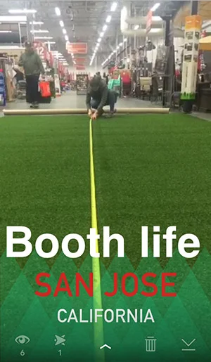
After a little over two months of planning I was ready to hit the round running. I arrived in San Jose and had 24 hours to go to HomeDepot, Ikea, the Mac Store and set up the booth. After making six trips to HomeDepot, I learned a few valuable lessons worth passing on:
Word to the wise: astro turf doesn't fit into a minivan or hotel elevators. It's also really heavy, which means that you might have to cut it in half in the middle of HomeDepot.
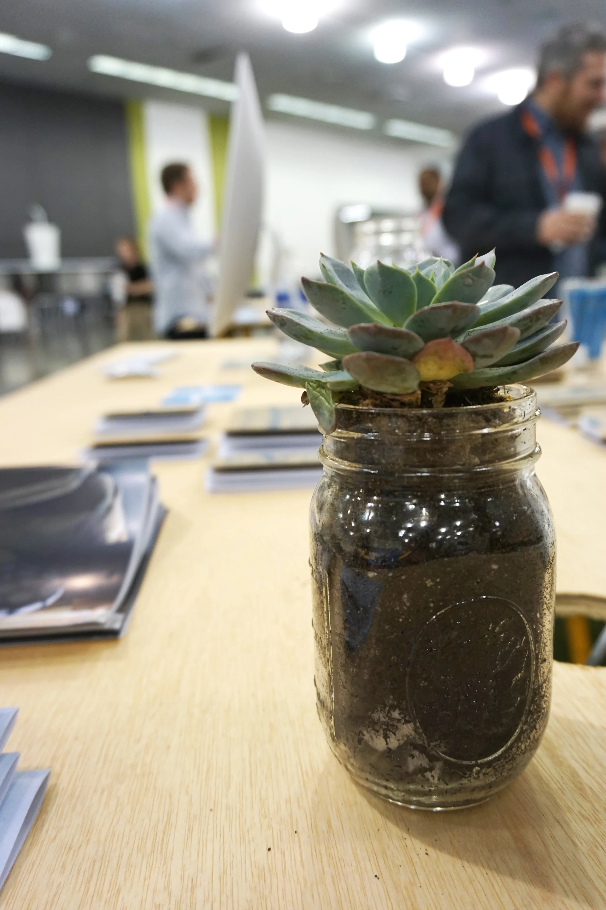
It's possible to plant 30 succulents in your hotel room after being awake for 24 hours—but only if you're surrounded with the best company, solid tunes and a few beers.
Once I gathered all of the materials, I assembled the booth with the rest of the marketing team. I was constantly tweaking my original vision to see what worked in practice.
The Best Booth in the Land
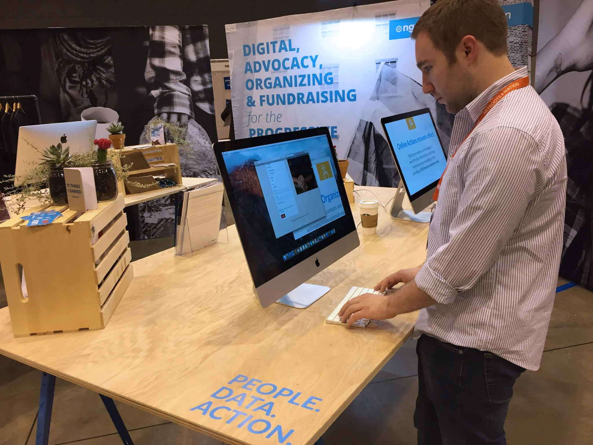
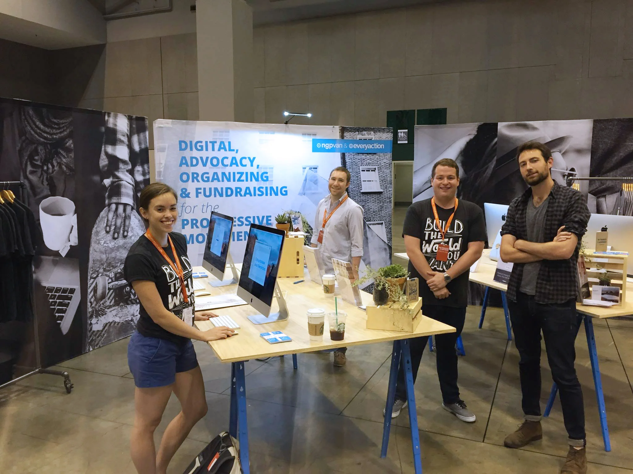
This was the booth I built in San Jose. It was pretty epic, but I learned a lot, and there were things I wanted to change. Fortunately my company had another conference later that summer. More on that in a sec.
Lessons Learned & Applied
A few of our successes in San Jose:
The nontraditional booth was a huge hit. Leaders from nonprofits of all sizes were intrigued by the aesthetics, sweet schwag, and overall vibe of the booth. The sales team landed conversations with organizations because of the booth. The booth became a conversation starter.
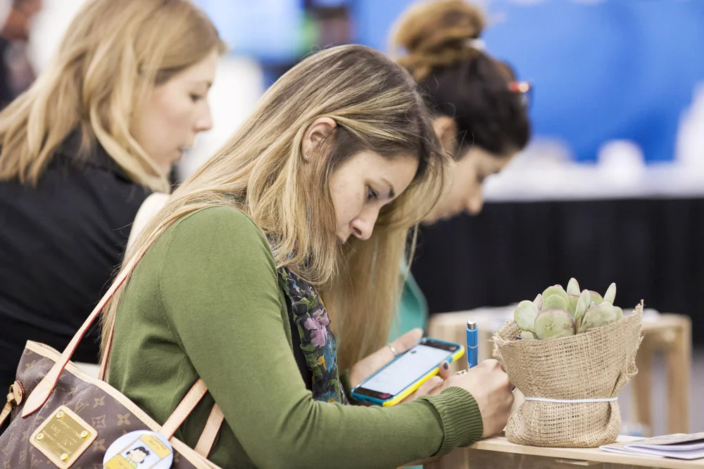
The succulents and plants were a huge hit and really inexpensive. Conference attendees were happy to see something green and living in the cavernous, poorly lit conference hall.
The branding of the elements inside the booth tied seamlessly to the branding of the booth.
A few of our "er, we can do better" moments
& how we adjusted for our conference in St. Louis:
The astro turf looked awesome, but it was really expensive, really heavy and a pain.
In St. Louis we opted to use the concrete floor and applied an eye-catching vinyl sticker boarder around the edge of our booth.
The lighting at in the hall was terrible.
I added a light to one of the backdrops. It was a small, but super helpful fix. The light drew the visitor's eye directly to our messaging and logo.
The San Jose booth felt too open.
I initially wrote off the use of backdrops because they felt too generic, but I found a way to add our branding to banners that felt genuine and unique. I brought the backdrops to St. Louis, and the space was much better defined.

