Case Study
Justworks Instagram Feed
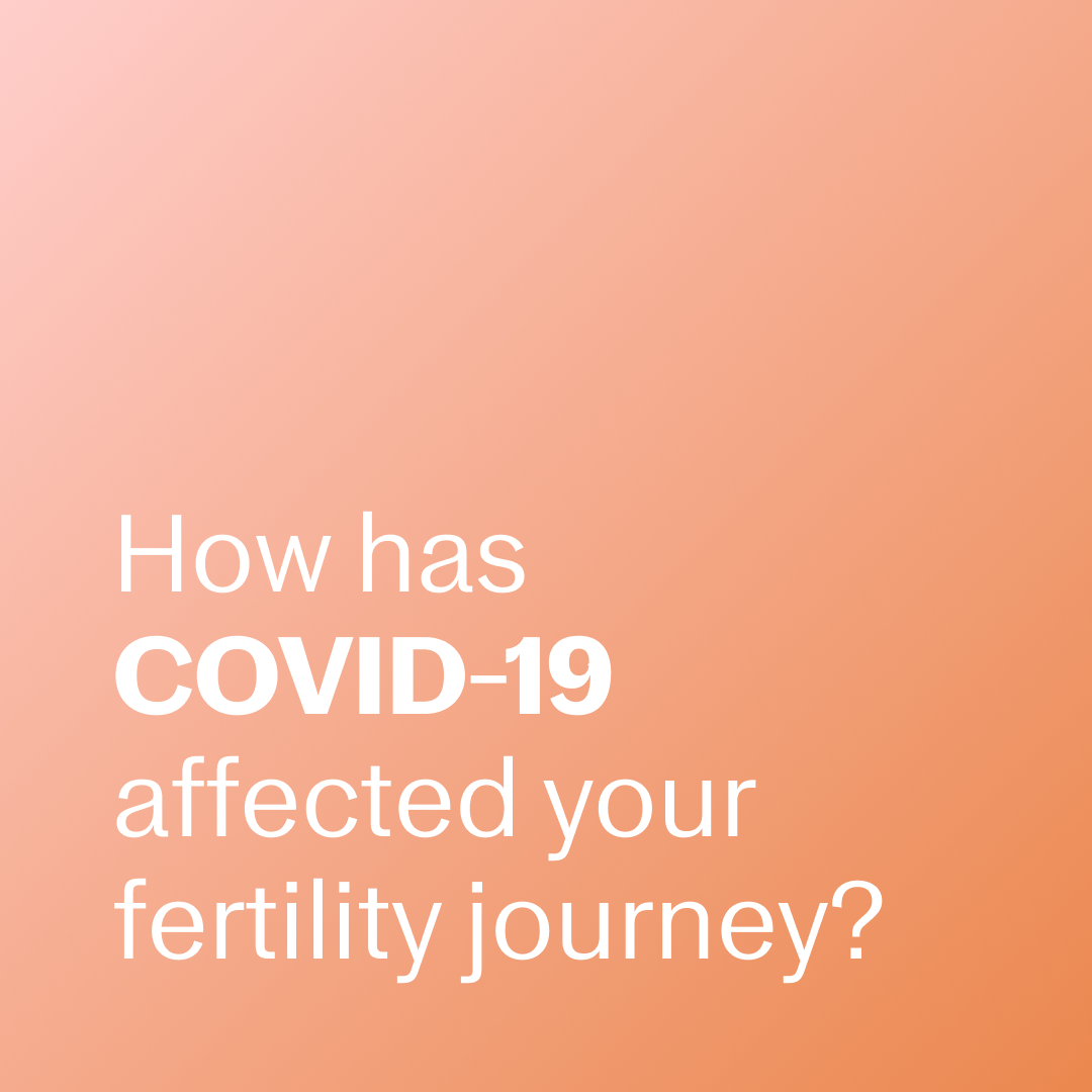
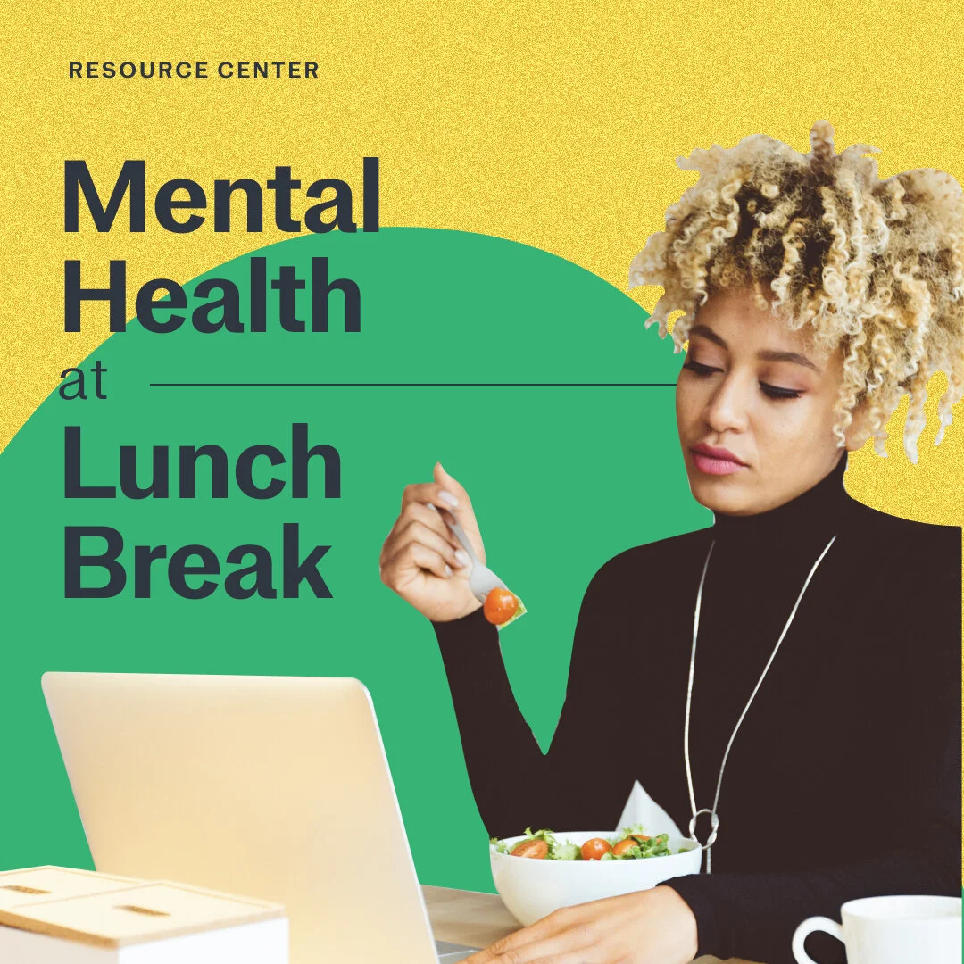
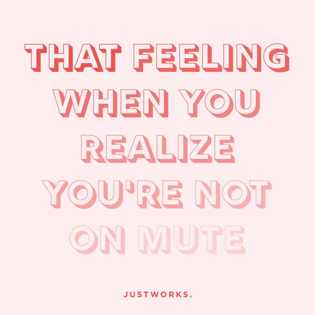
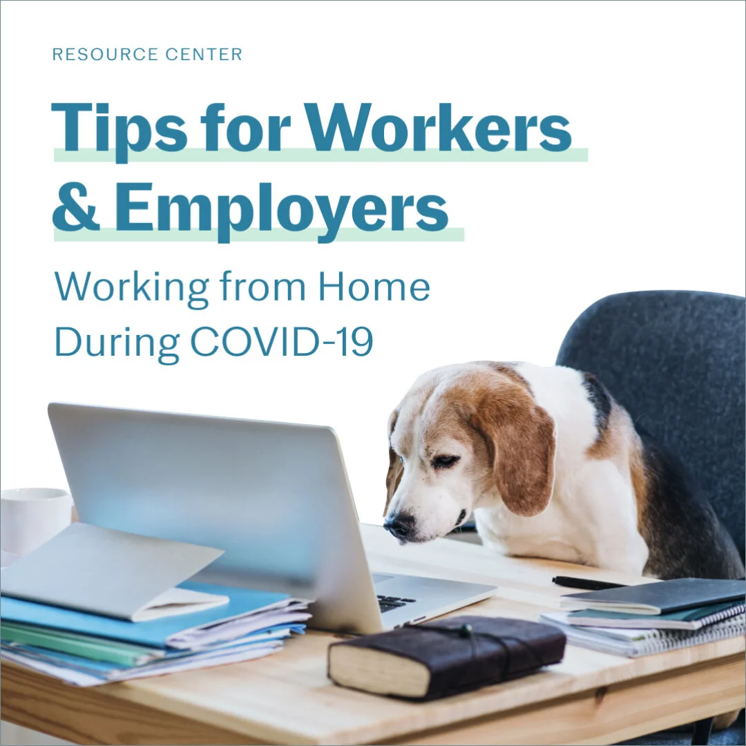
Justworks’ Instagram, @justworks_hr, is a top-of-funnel, brand awareness tool that builds community among HR leaders, small business owners, and employees. Over the past year, I partnered with our content team to grow the feed by 11.7k followers (🎉).
Interesting B2B Instagram feeds are far and few between—especially within the HR category. Our goal is to be as creatively risky and confident as @refinery29, but as helpful as @nerdwallet. We’re constantly iterating, keeping an eye out for new trends, and thinking about how to best share our content with our social audience.
Role
Art Director/Lead Designer
Keep @justworks_hr top of mind for all followers.
Mission
Goal
Create a design toolkit that is capable of expressing a wide range of voices or tones (from knowledgable to friendly) in the Justworks social environment.
Audience
Our Instagram audience is 76.4% female, 45% 25-34 years old, and primarily located in New York City and LA.
Design Process
Design Principles
Posts need to:
be a trusted source of information for customers & prospects
lead customers & prospects to resources & content or take an action beyond Instagram
contribute to building our small business community
convey a wide range of emotions from knowledgable to resilient to friendly
Building a Framework
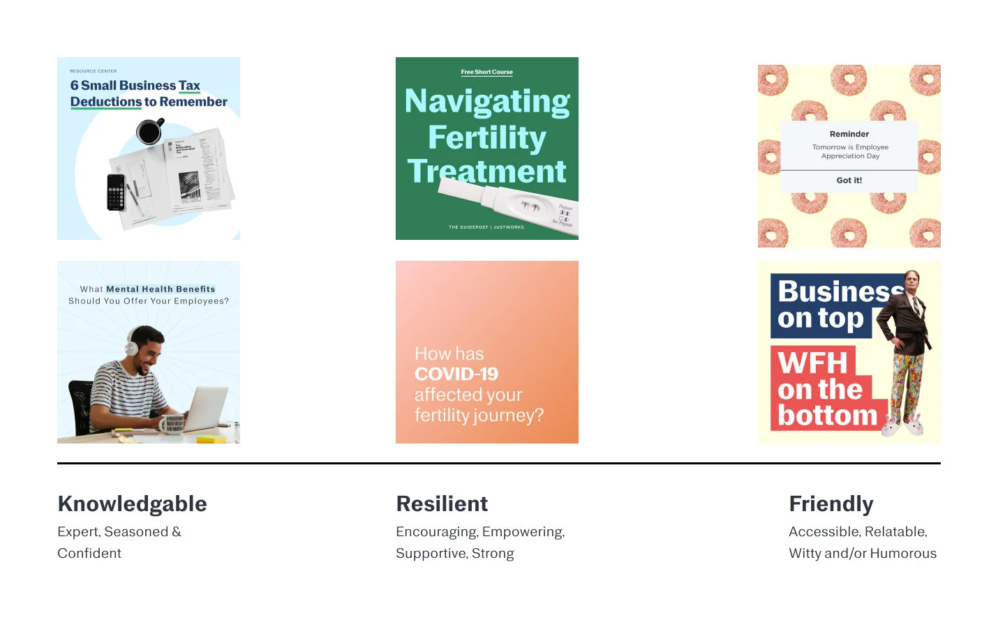
I started building the foundation of the design toolkit with three words—knowledgeable, resilient, and friendly. I chose these words because they represent the range of emotions we try to convey through our posts. These words also align with the language that our content team uses to describe Justworks’ brand voice and tone.
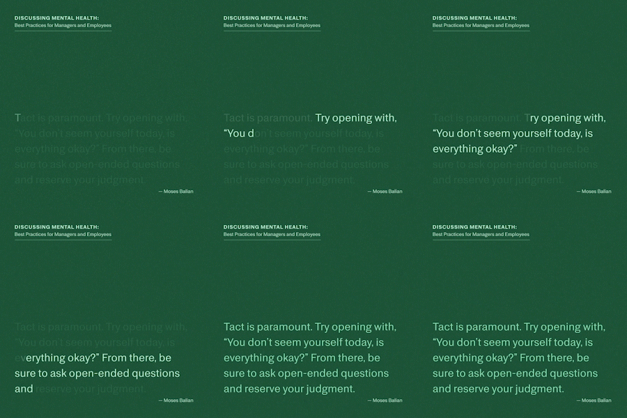
Knowledgeable: Expert, seasoned & confident
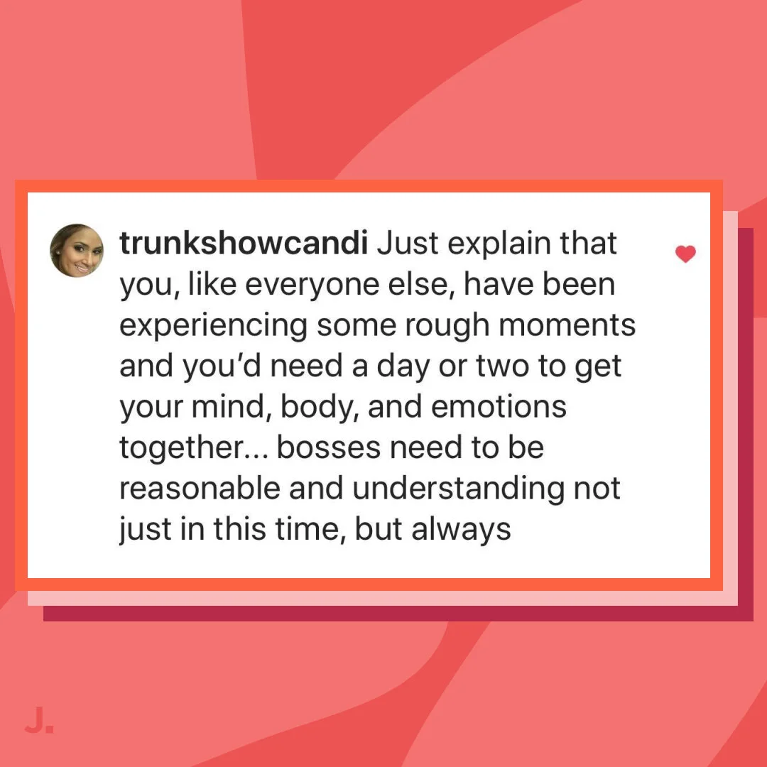
Resilient: Encouraging, empowering, supportive, & strong
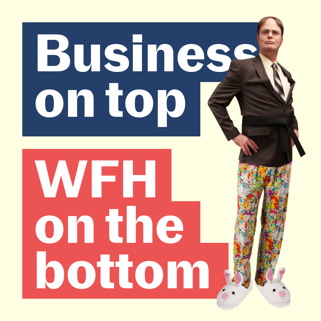
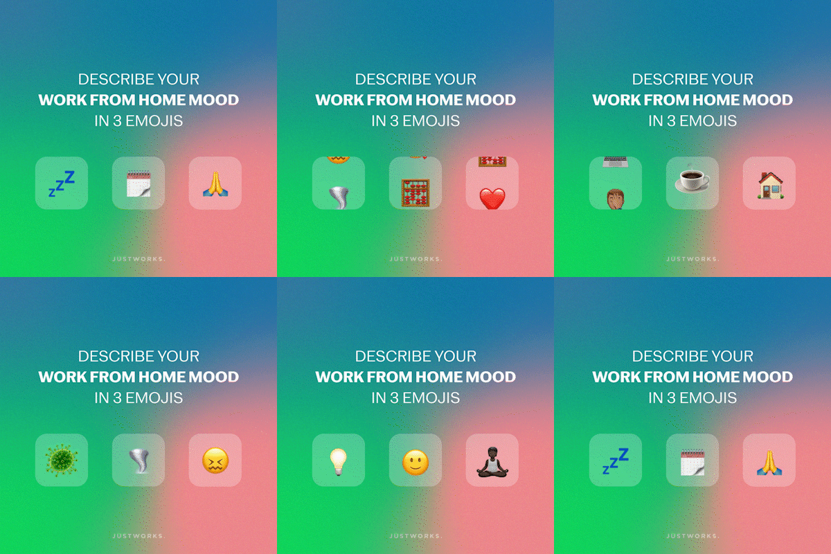
Friendly: Accessible, relatable, witty, and/or humorous
I organized existing Instagram posts within these three buckets so that designers could start referencing design elements that contributed to a post feeling “knowledgeable”. “resilient” or “friendly”. (See figure 1.)
Fig 1. Initially we mapped our three categories onto a linear line.
Design Guidelines-ish
One of the reasons why we find the Refinery29 Instagram feed so inspiring is that they seem to constantly evolve their look and feel. A few of their posts are templated, but there seems to be a lot of freedom to explore new design trends. Keeping that in mind, I created a loose list of guidelines to help the team in making design decisions without being too didactic.
Typography
Use Oately for posts that fall within the resilient and knowledgable categories.
Use Rig Solid for headlines (if necessary) when creating a post in the Friendly category.
Color
Try sticking to Justworks colors when possible. If it isn’t possible, use a color that fits within Justworks color family.
Images
Try to choose images that feel authentic to Justworks. Prioritize images you’ve taken yourself over stock photography.
Part of the reason why images feel posed or stocky is because the environment doesn’t feel real. Try as often as possible to remove the subject out of the background. It also helps to have the image interact with the background or text.
2/3 Rule
When creating a post, aim to keep 2/3 of the post consistent to Justworks’ visual brand guidelines. For example, if a post has images, color, and text, make sure that 2 out of the 3 follow brand standards. If not, add the Justworks logo.
Tracking Trends
When we initially met as a team to discuss the three categories, we gathered posts from other brands that we found inspiring. We sorted these posts into our three categories, spoke about why we found these posts compelling, and decided which design elements we’d like to incorporate into our feed. We’ve found this to be a helpful exercise, and continue to incorporate it into our monthly retrospective meetings.
Monthly Retrospective
Every month, I host a retrospective or “retro” meeting. The goal of the meeting is to reflect on the work we created over the past month. We kick-off each meeting with another round of inspiring posts, and then jump into discussing three questions:
What went well, this month?
What didn’t go well?
What do we want to commit to changing over the course of next month?
The questions are purposefully vague. We chat a lot about process, communication, design decisions, post performance, and trends that we see other companies or accounts exploring.
Tools
We’ve iterated on our process a lot over the past twelve months. We’re constantly tweaking it to improve design choices, communication, and efficiency. We use a combination of Asana, a mini creative brief, Slack, and Figma to create thoughtful work while remaining agile.
We’re Learning Along the Way
After the first month of working within this framework, we realized that our three “buckets”—knowledgeable, resilient, and friendly—shouldn’t be put on a spectrum. Often times a post needs to be friendly and resilient, or knowledgeable and friendly. Recently, we’ve started thinking about these categories as a triple Venn diagram. (See figure 2.)
We try to be as authentic and honest to our audience as possible. We’ve relied on stock photography in the past because it’s the easiest way to acquire new images. Moving forward we’d like to rely less on stock images and use photos we’ve taken or hire a photographer to capture images unique to Justworks.
We’d like to develop a better framework for testing and tracking post metrics. Sometimes it’s difficult know if a post was successful because of the content or design decisions.
Moving forward we’d like to host feedback sessions with prospects, current customers, and followers to start understanding our audience at a deeper level.
Fig 2. After working within the framework, we realized that we should think of the bucketed categories in an overlapping Venn diagram. A post can be friendly and knowledgeable, resilient and knowledgeable.


